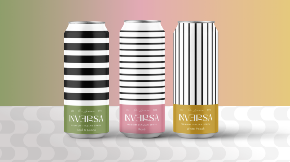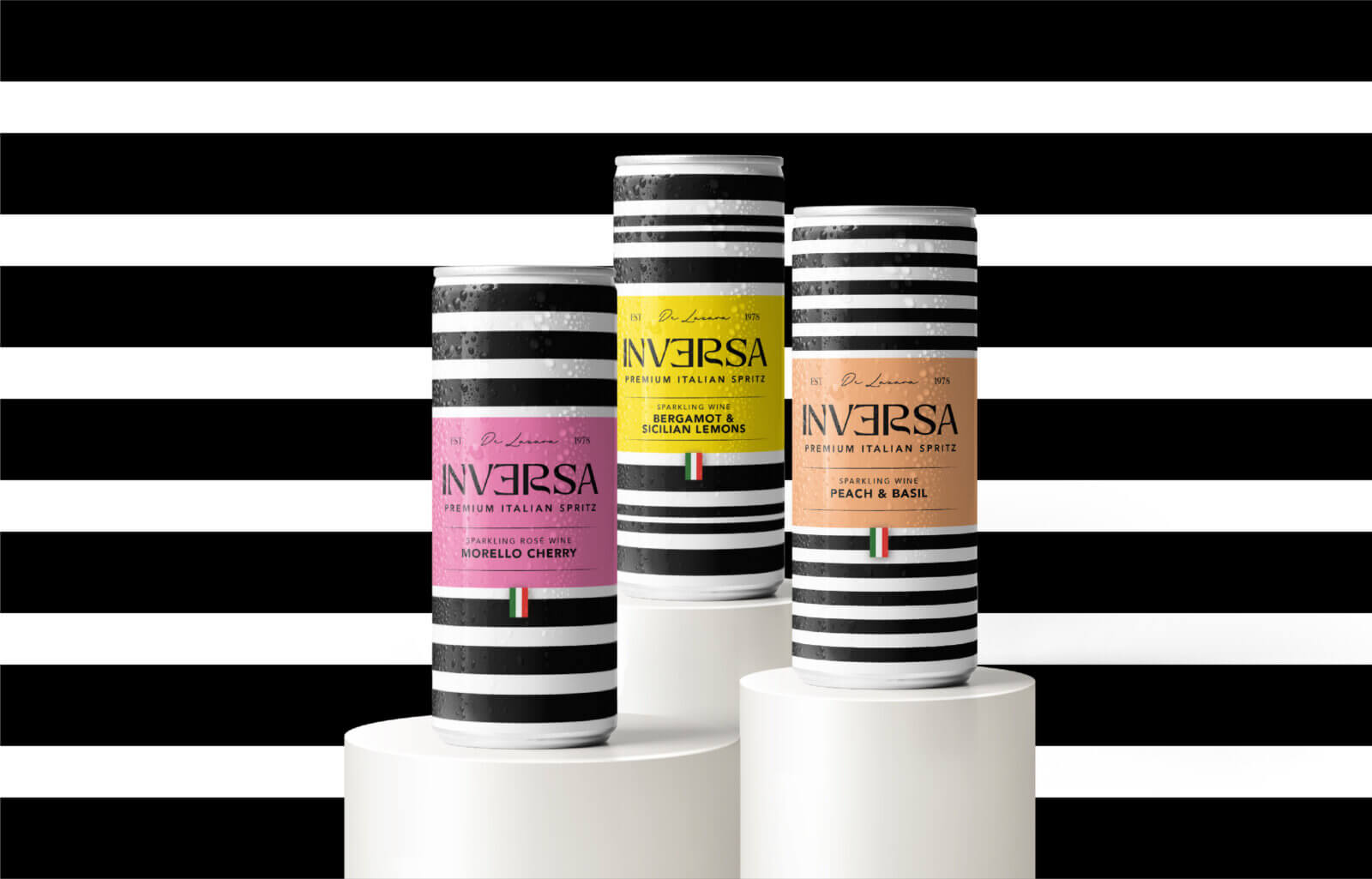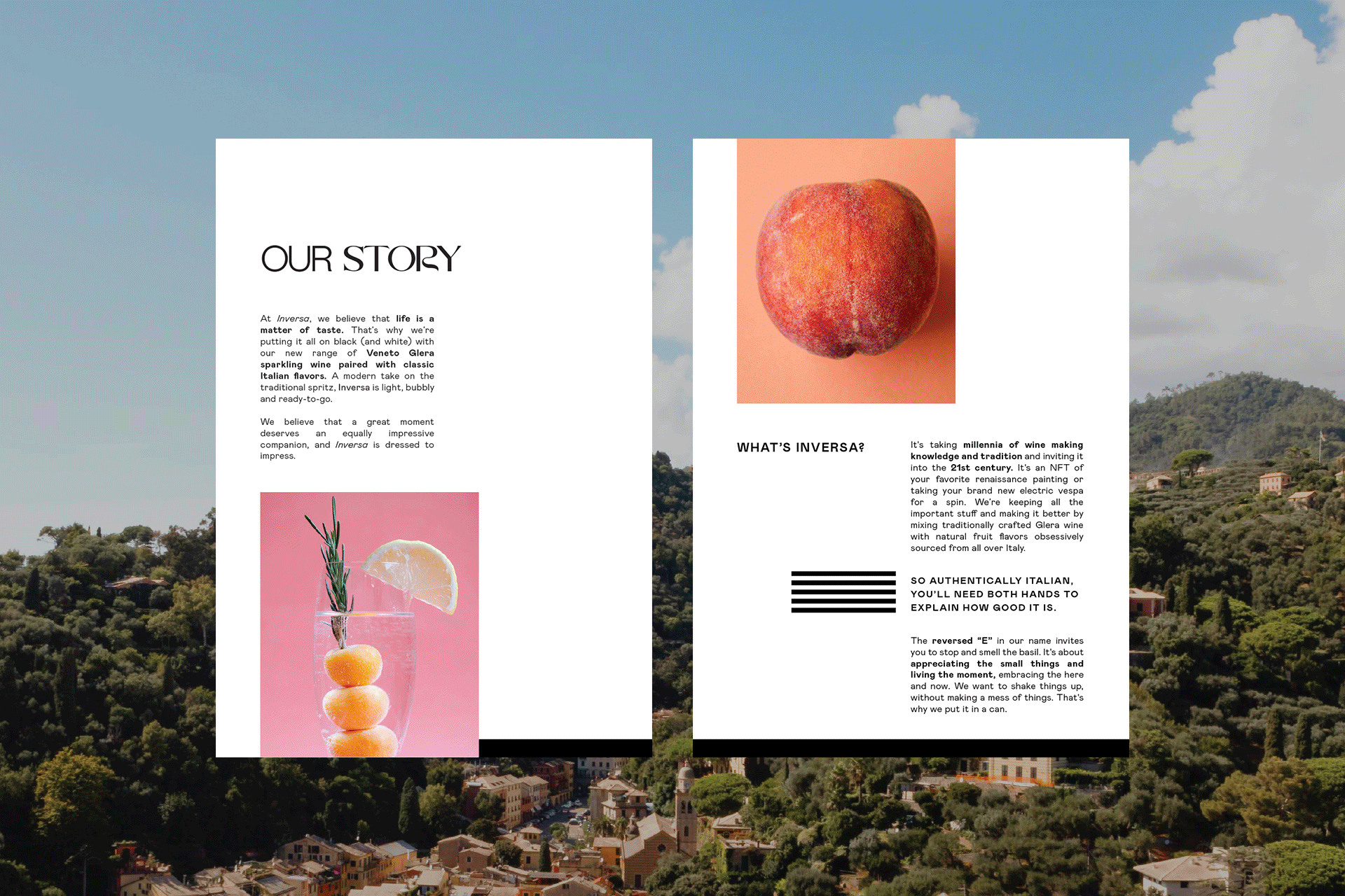
Inversa
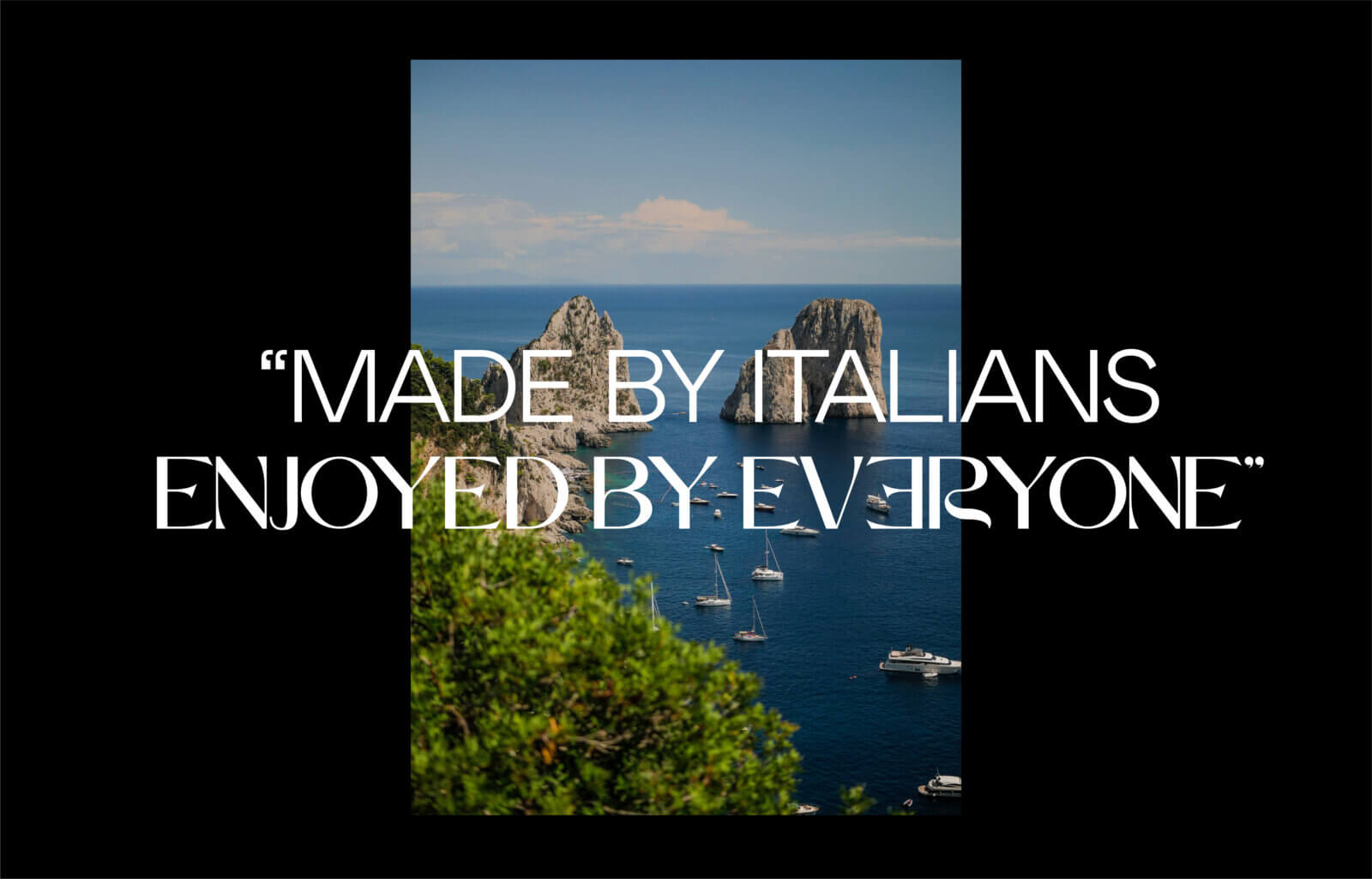
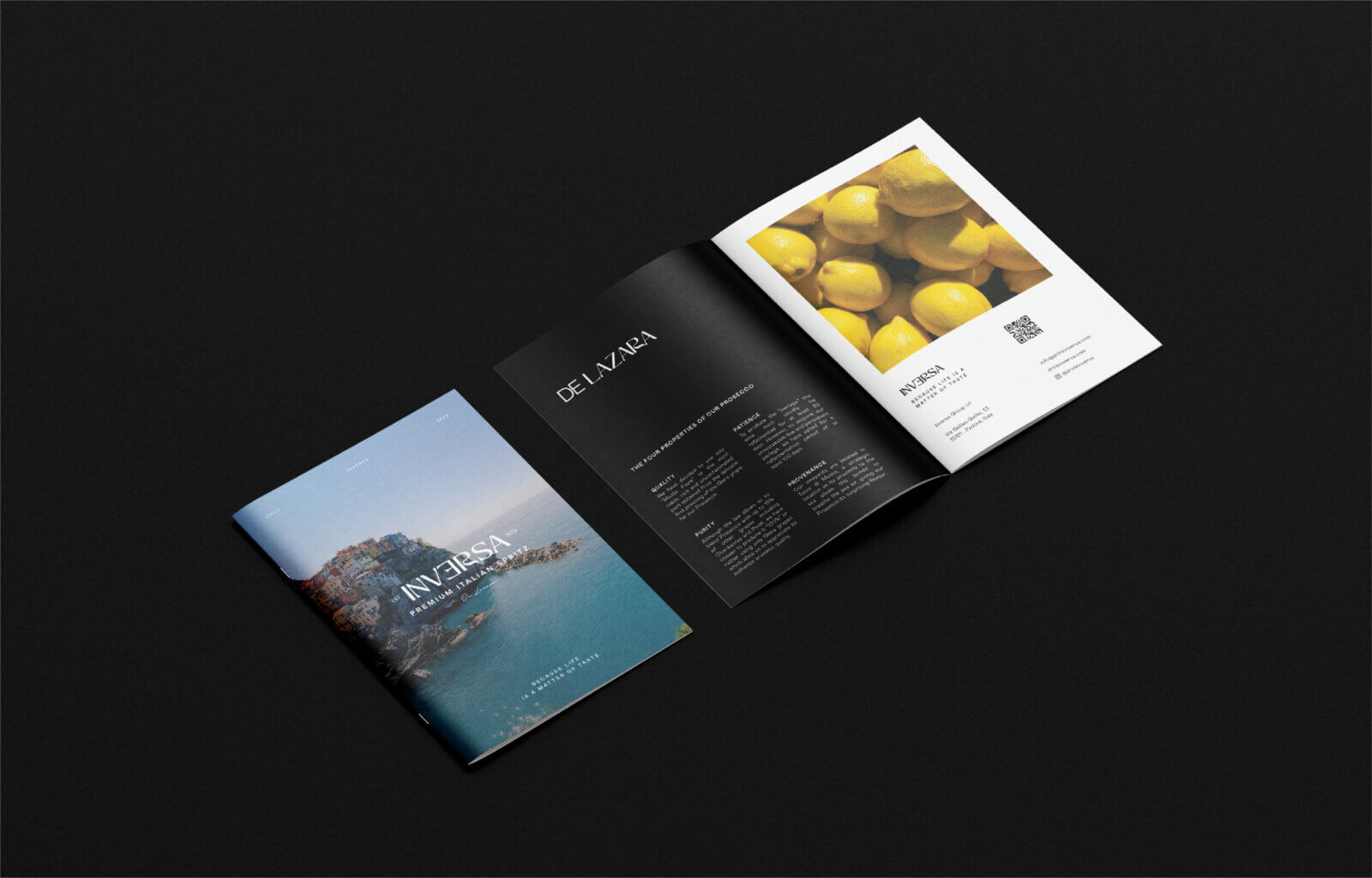
De Lazara is a family-owned Italian Winery that has produced Prosecco since 1978. In 2021 they saw an opportunity to enter the RTD market in the US, so they needed a brand for it.
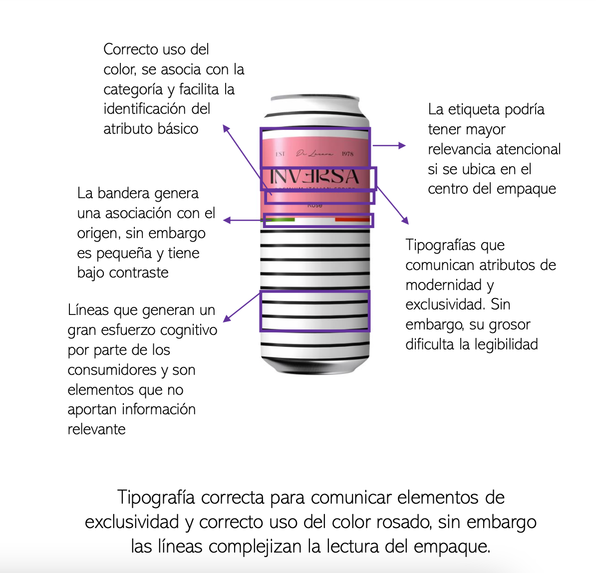
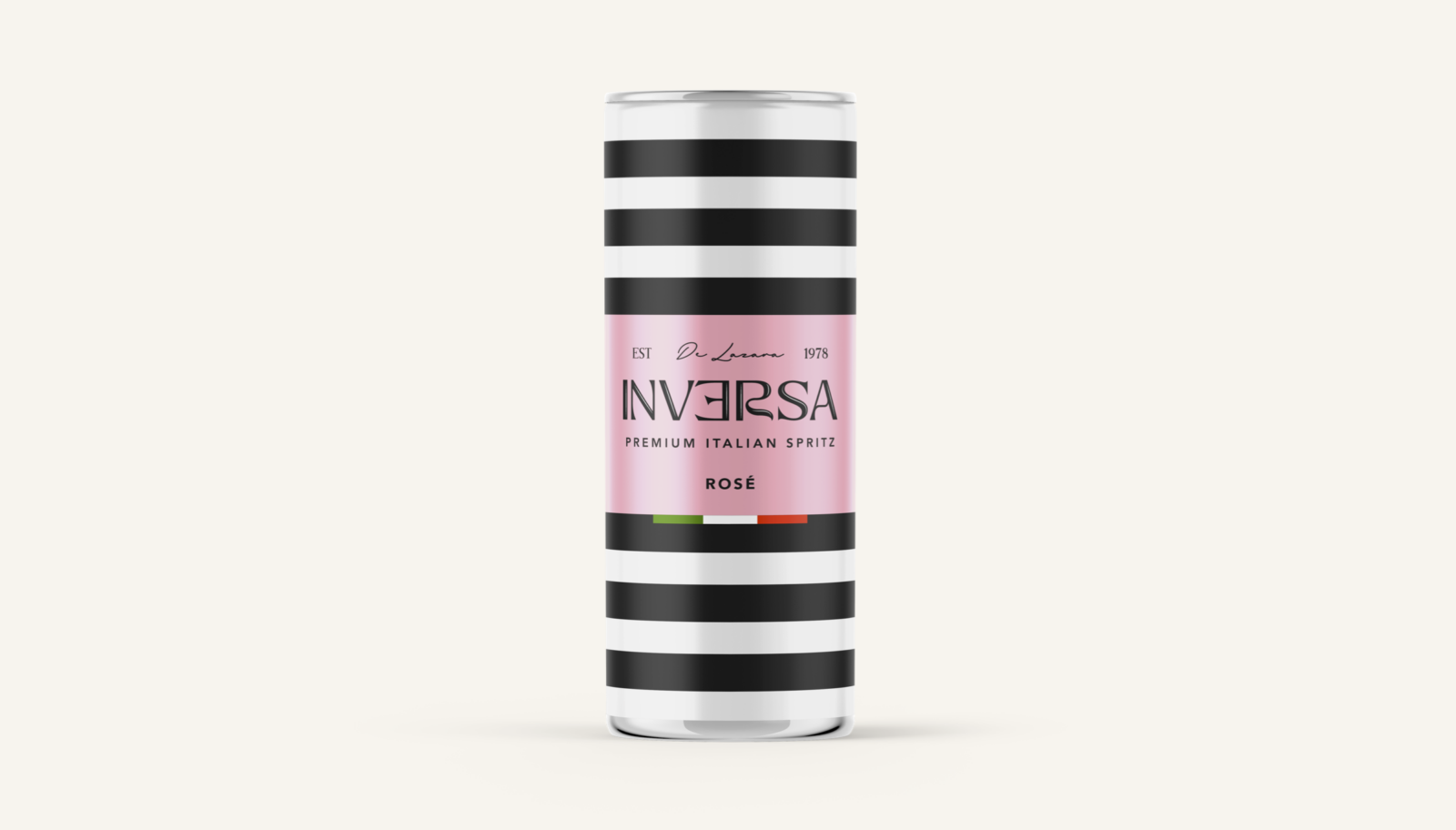
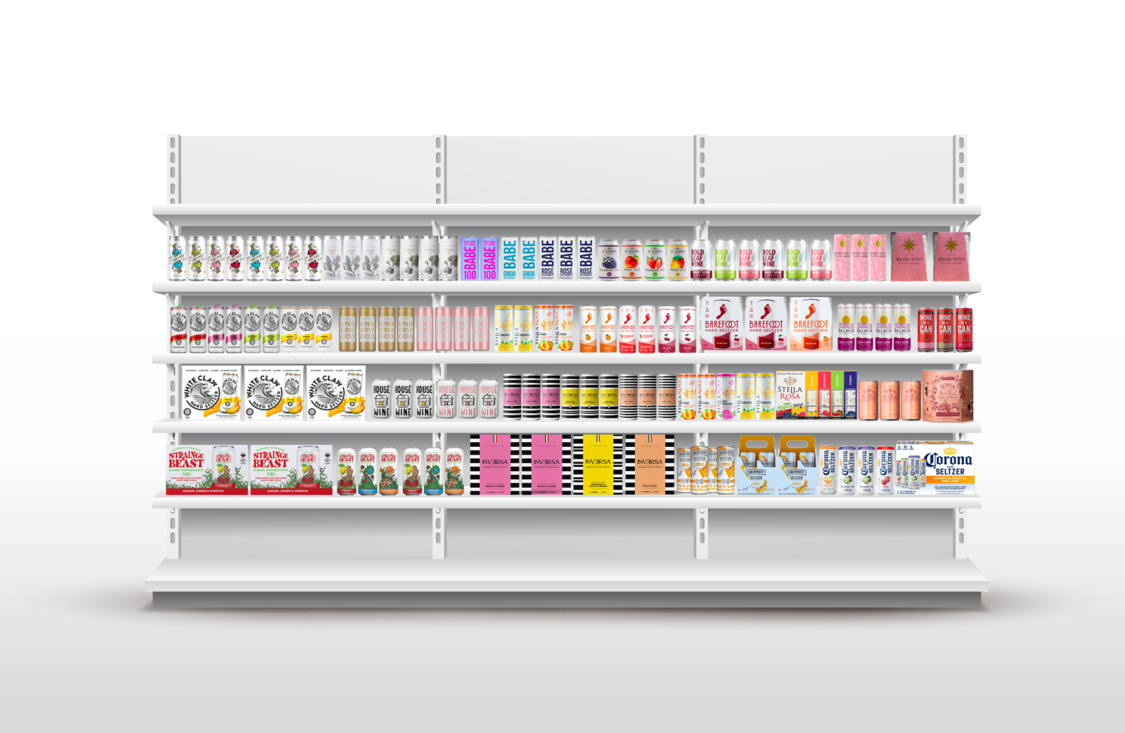
The challenge was to design an upscale Italian brand that would stand out in an already saturated market full of packaging screaming for attention with bright colors, bold typographies, and sassy tones of voice.
By combining scientific research and artistic inspiration, I developed a brand concept that would pass the "stand out" test and successfully communicate the Italianisimo brand value the client wanted to get across.
Check out the process from start to finish by scrolling down:
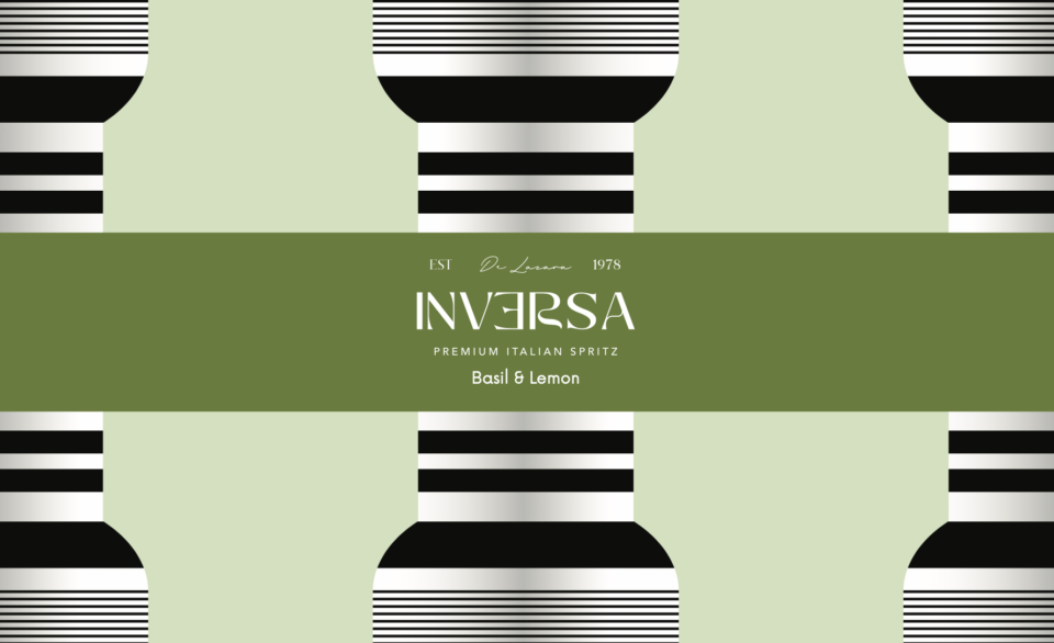
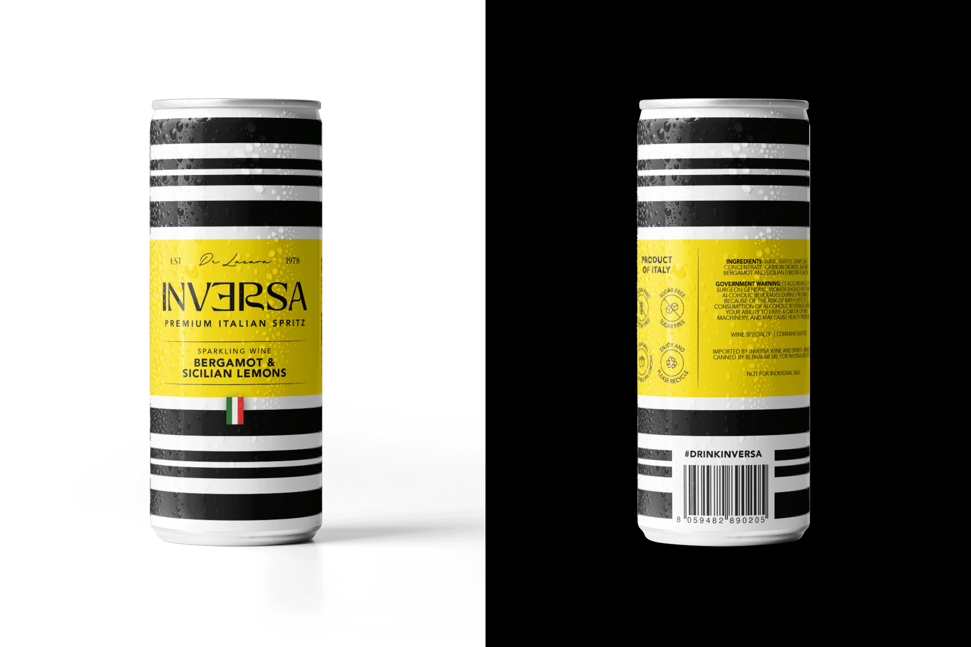
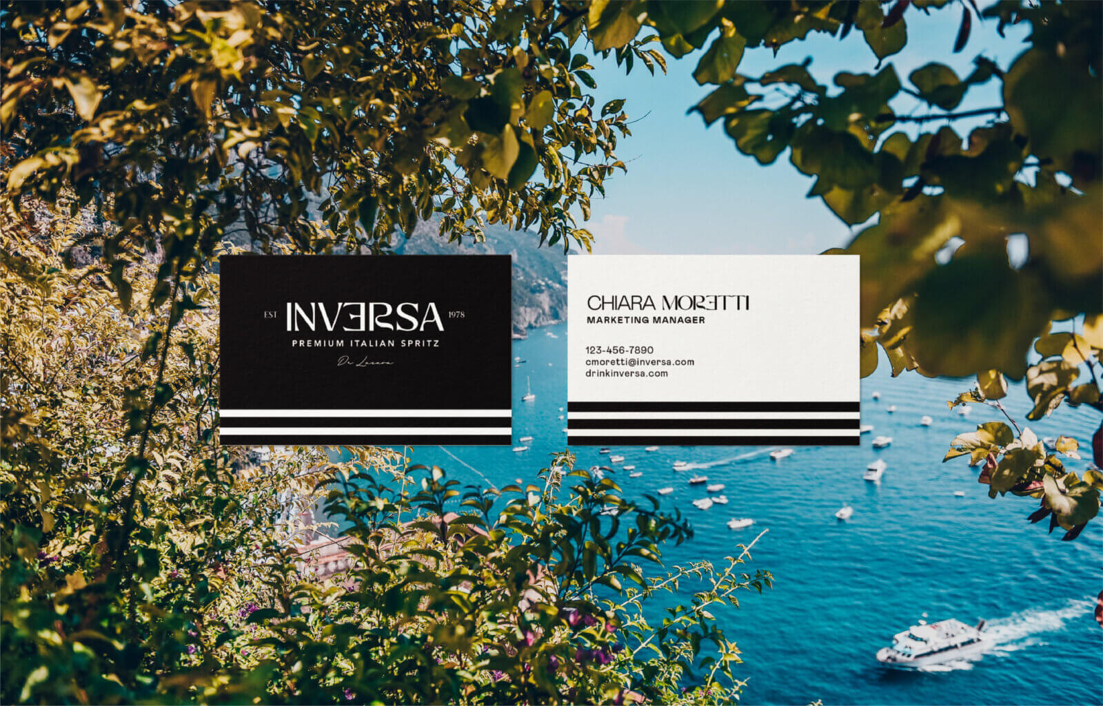
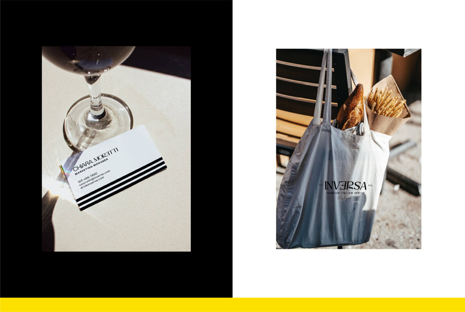
Italianissimo
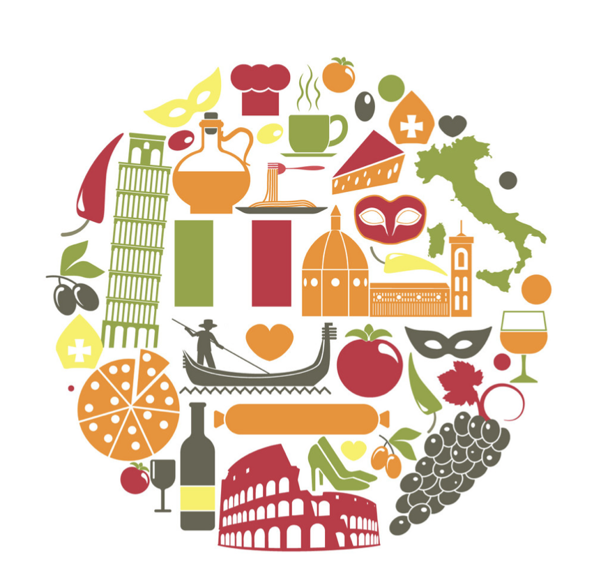
The client wanted the brand to be first of all, Italian, without using overused Italian cliche symbols. To start looking for unique Italian territory I first mapped all the icons I wanted to avoid.

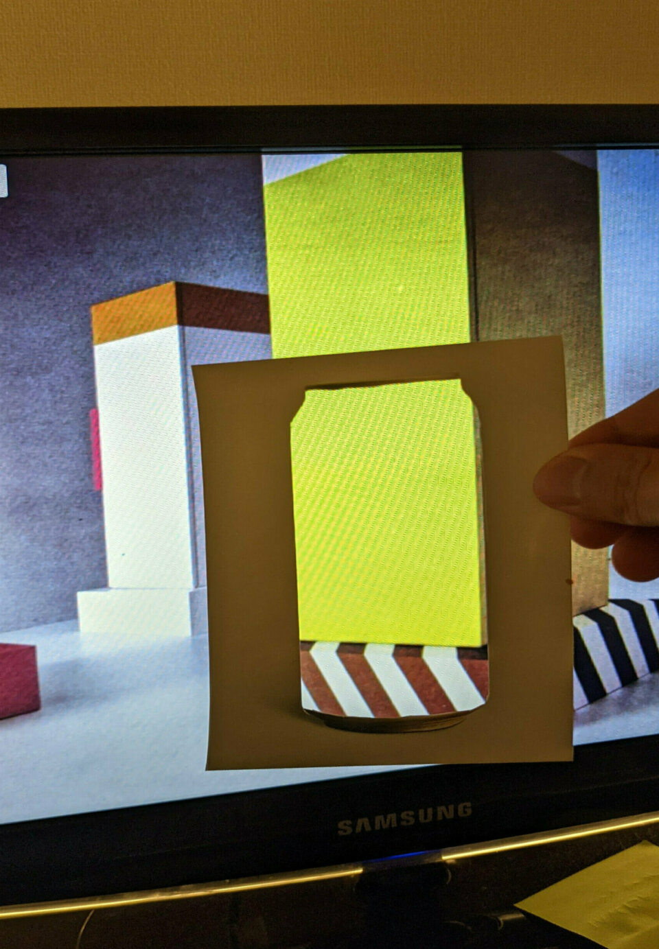
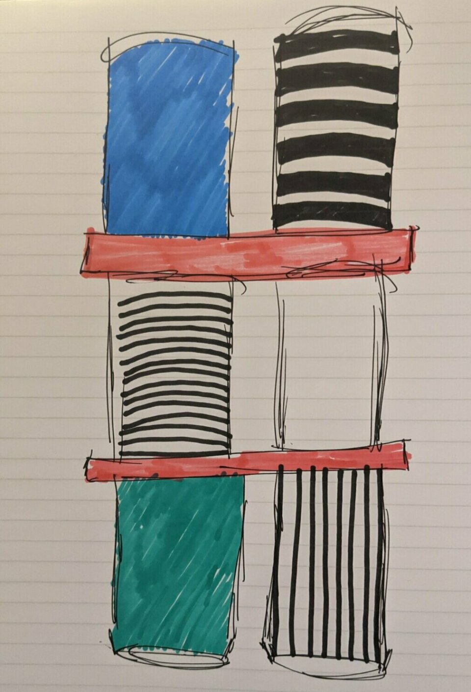
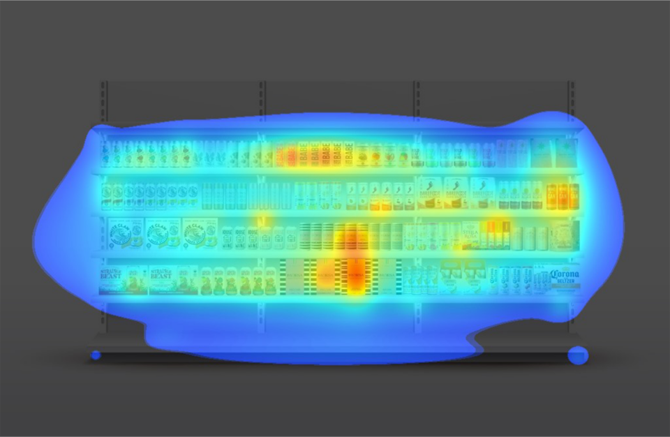
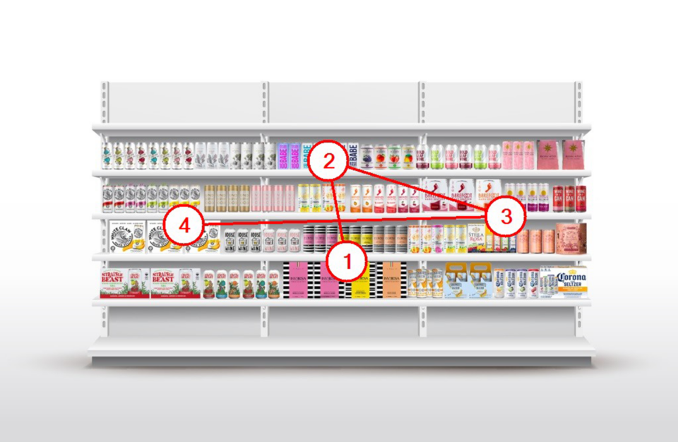
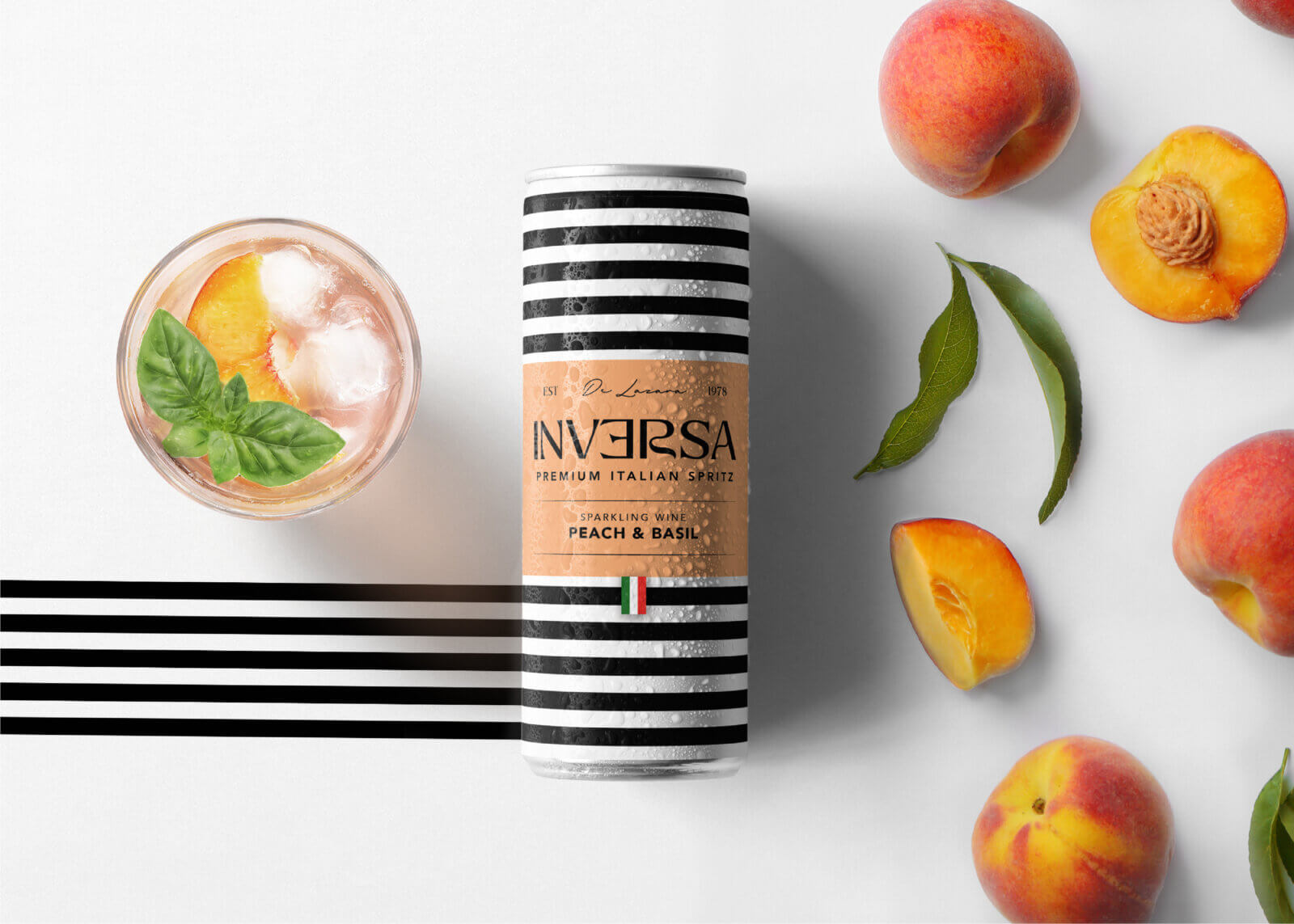
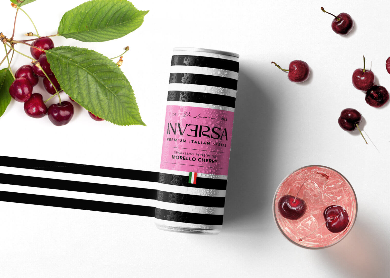
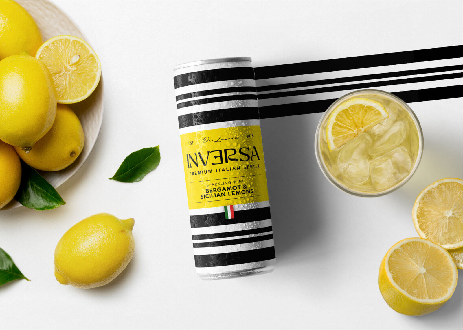
During the project‘s research phase, I found some interesting evidence about how certain graphic patterns are more eye–catching than others. For example, one of the studies explained how stripes are especially good at creating tension in vision, which reminded me of how they are often used in advertising to draw attention to a product.
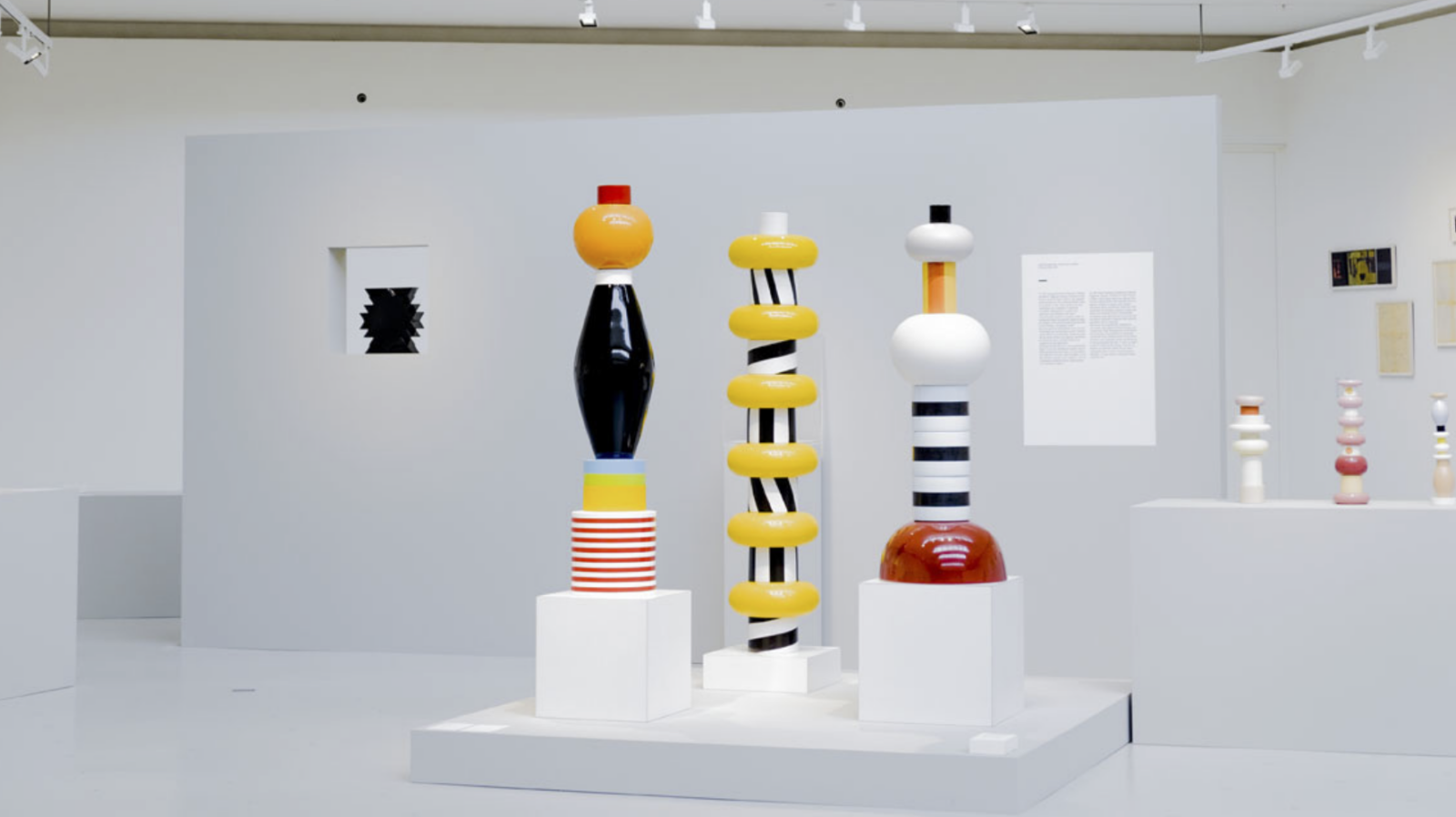
THE MEMPHIS MOVEMENT